Talk: The New Sex Ed
Mobile Onboarding
User Research + Interactive Prototype
for a Sex education web app

Talk: The New Sex Ed
Mobile Onboarding
User Research + Interactive Prototype
for a Sex education web app
We live in a sex-saturated culture, but the topic is rarely discussed openly or effectively by schools or by parents. This leaves teens without the knowledge and support they need to make good decisions and keep themselves safe.
For over twelve years, Talk: The New Sex Ed has been on a mission to design, study, and advocate for best practices that empower young adults to make informed, responsible choices about their relationships and sexual health.
In order to reach and serve more young people in need, Talk is undergoing a transformation to adapt their successful classroom-based educational model to an online format.
To begin tackling this challenge, Talk is developing a mobile web app for college students across America. Our team was entrusted with designing an amazing onboarding experience and style guide for the platform.
“The quality of [sex] education young people receive should not be dictated by where they live or the school they attend.”

1. Welcome
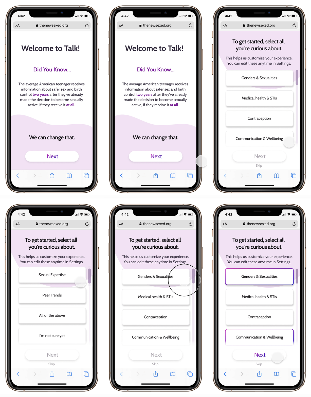
Get users excited for sex ed like they’ve never seen it before: private, relatable, and tailored to you.
2. Motivation
Go on, we’re listening! Make users feel heard by starting with their personal motivations.
3. Background
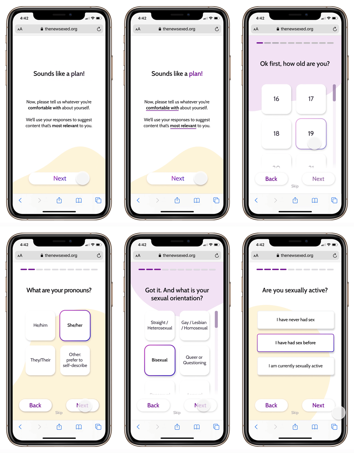
It’s all about you! Ask the user to describe themselves and their prior sex education for a personalized experience.

4. Sign Up
Now that you’re onboard, get a sneak peak of what’s waiting for you and sign up to get started!
There’s no second chance at a first impression! Onboarding is your first (and only) chance to attract new users. Use this opportunity to demonstrate your product’s value, to get a better understanding of your user, and to transition smoothly into the app.
To see great onboarding in action, our team explored well-reviewed products across a wide array of industries, and ran a quick-and-dirty Competitive Analysis on the onboarding experiences of two other online sex ed programs: Real Talk and Planned Parenthood’s Ask Roo.
Check out some of our key takeaways below:
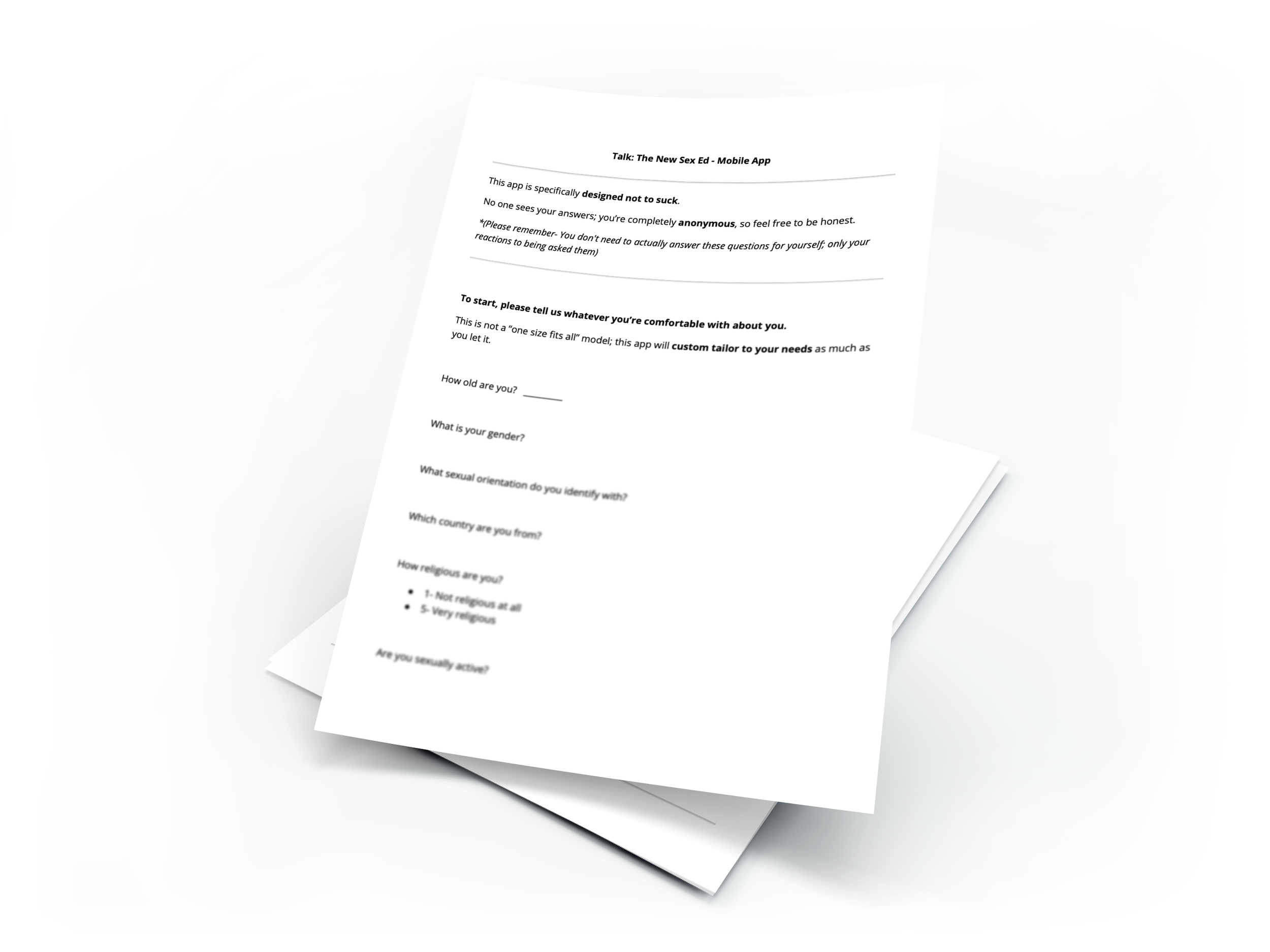
Our team worked with Talk to develop a set of informative interview questions, followed by the lowest-fidelity onboarding prototype possible: just text on paper.
Our “pretotype” document included basic paper questionnaire formatting, potential content, and specific language provided by sex educators at Talk. All other details and styling were purposely omitted to aid participants’ focus on the relevant information.
Our team conducted semi-structured interviews with five American college students. We tested the pretotype via the Think Aloud Protocol, asking users to verbalize their thought process as they imagined completing this survey document on a mobile phone.
Each interview was transcribed (Otter), organized by interview question (Google Sheets), and imported to a collaborative digital whiteboard (Mural) as virtual sticky notes. Our team then synthesized the qualitative data using affinity mapping to come to a shared understanding and generate insights.
Synthesis of Paper Pretotype user testing results.
(Click image to see more)
Sketches are the fastest, easiest, and most inexpensive way to help clients and teammates visualize what’s possible and give even more constructive feedback. Use parallel prototyping to independently create super-quick illustrations that demonstrate a wide variety of ideas.
Based on our client’s feedback, we were able to move forward to iterate on three viable interfaces: carousels, questionnaire forms, and text messaging.
We designed three mobile-first, low-fidelity prototypes to save product design time and put Talk in the ideal position for a responsive website design later on.
An introductory carousel, with two language styles: “friendly + casual” content (light gray circles), or “motivational + informational” content (dark gray circles).
A classic questionnaire + progress tracker. Asks the user about their motivations, goals, and background. Ends with a personalized program recommendation.
“Text” with a friendly bot that introduces the app, and asks the user about their background and interests. (This instant messaging design also reflects the “chat fiction” device that Talk was considering for the rest of the app.)
Our team ran six semi-structured interviews with American college students over video calls, screen-sharing each prototype in randomized order for user feedback.

Synthesis of Low-Fidelity Prototype user testing results.
(Click image to see more)
Here’s what we learned:
Our users enjoy familiar interfaces with progress bar + questions by category
Long questionnaires can easily feel impersonal, boring, + slow
Text messaging feels natural + relatable, but limited + confusing as onboarding
Users prefer short + informal wording with emotional appeal, over more formal wording with educational appeal
Anonymity (“No one sees your answers”)
Personalization (“You are unique”)
Difference from traditional sex ed (“Not your grandma’s sex ed”)
Scientific basis (“Built by teens, parents, educators, and scientific research”)
Inclusivity of demographic options (sex, gender, orientation, etc.)
Equipped with new findings, our team iterated on each low-fidelity design based on user feedback and fidelity level.
Due to its popularity, we begin the mid-fidelity onboarding flow with an updated Informal Carousel to introduce Talk and the web app’s top user benefits.
Learn about your user with the updated Questionnaire Forms, including fewer questions, more engaging language, + skip options.
Alternatively, keep your user engaged with the updated Chatbot Messenger, including expositional modal dialogs + skip options.
With the onboarding experience nearly complete, users are given their personalized recommendations and directed to an easy registration screen.
Our team ran user + usability testing with six American college students. With interactive access to each prototype, they were asked to complete the onboarding experience while verbalizing their though process via the Think Aloud Protocol.
Synthesis of Mid-Fidelity Prototype user testing results.
(Click image to see more)
The Questionnaire is simpler, better organized, more recognizable, and feels more anonymous.
The Chatbot is more fun and personalized, but at the cost of feeling less anonymous. Not everyone wants to “talk” to a chatbot about private or sensitive topics.
All participants thought that the current onboarding length is good.
All participants loved the current wording.
Most of the participants said that they would download this app if it was available.
However, half of the users wanted more examples of the app’s content before they would sign up (e.g., real screens in the personalized recommendations).
Informed by our prior research, we created a full-color, mostly functional Figma prototype and corresponding style guide. The final onboarding user flow has been broken down into five sections that can be further tested and used modularly.

1. Welcome
Brand Launch Screen + Top User Benefits Carousel
Carousel to summarize intent & capture interest
Get users excited with a sneak peak at what Talk’s app can do for them
Reassurance the user that Talk’s sex education is modern, relatable, private, and tailored to them

2. Motivation
Self-Selected Personalization
Go on, we’re listening! Make the user feel heard by starting with their personal motivations.
This ‘hook’ helps users recognize their own unique goals, and helps Talk deliver a personalized experience.

3. Demographics
Gather Basic User Info
It’s all about you! Ask the user to describe themselves for even further personalization.
At the same time, Talk gets to gather a wide variety of quantitative and qualitative data on their users. Win-win!
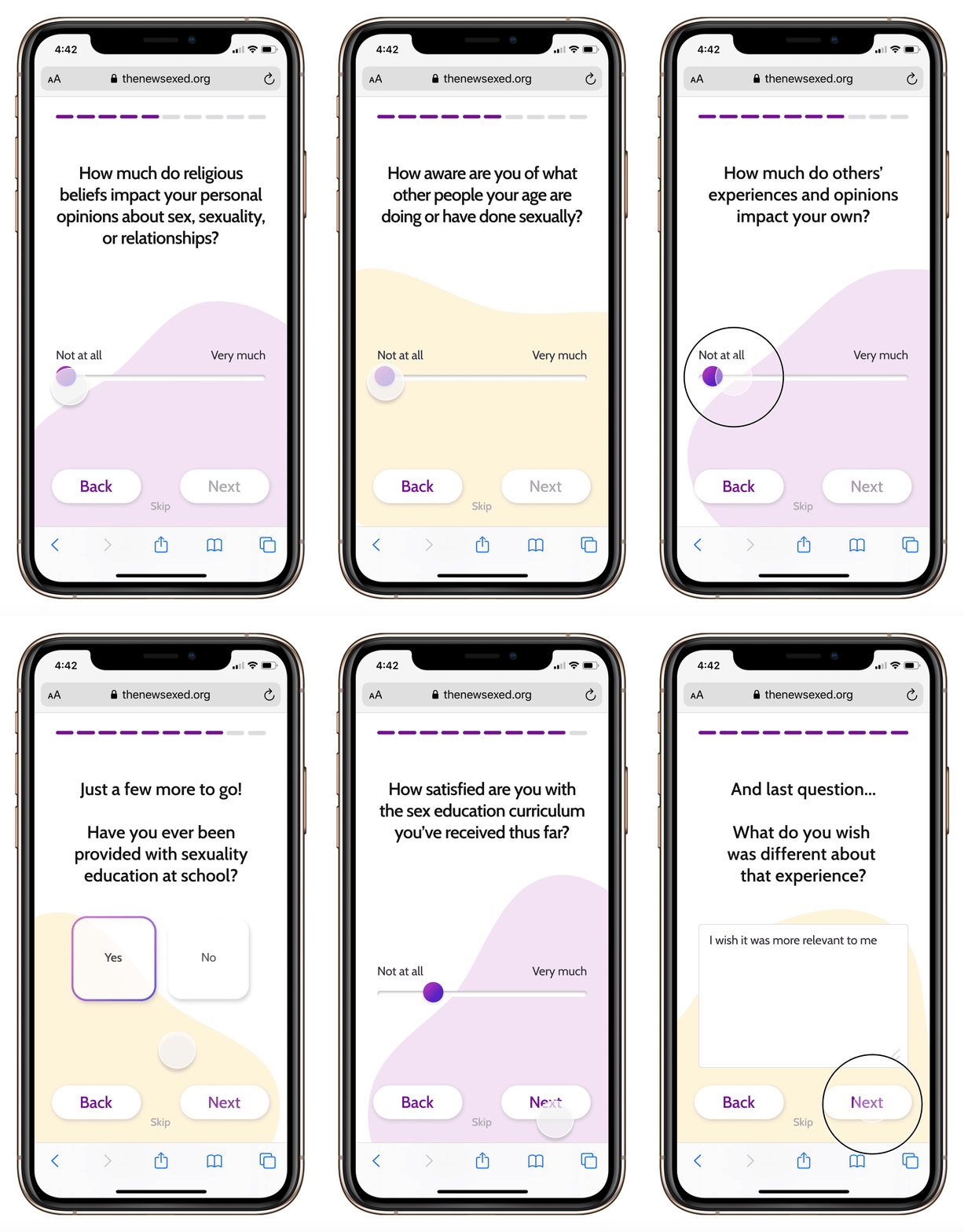
4. Experience
Gauge Existing Sex Education Level
What do they already know? Meet users where they are by asking about their past experiences with sex education.
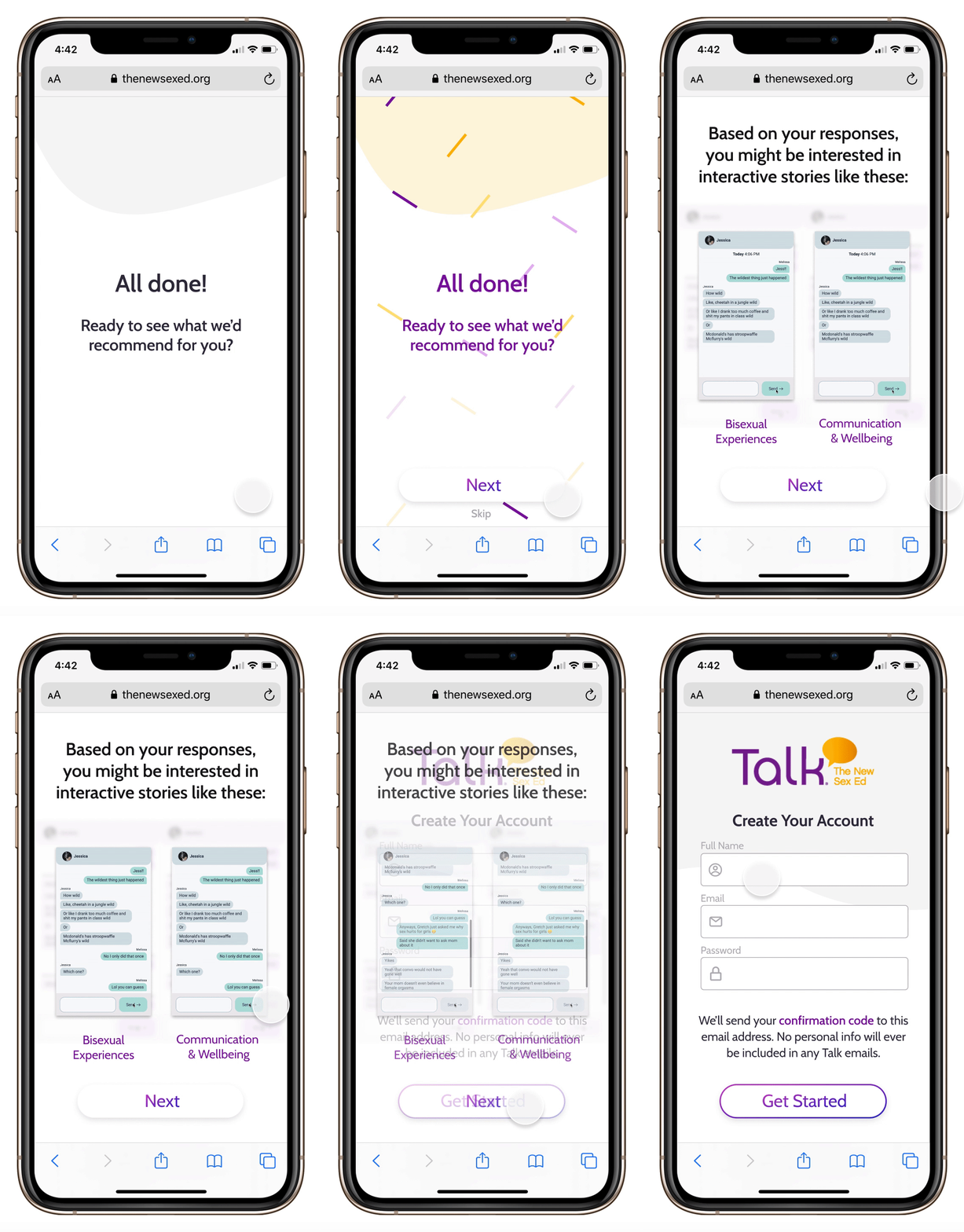
5. Sign Up
Personalized Recs + User Registration
Based on their responses, get a sneak preview of the kinds of interactive stories and materials Talk offers.
Now that they’ve put in time and energy, finish with an easy account registration!
Outside of onboarding experience research, our team did some extra sleuthing to benefit our clients at Talk.
A prior team of user designers had come up with a prototype for Talk that our client opted not to use. But that doesn’t mean we can’t learn from it!
Our team conducted five semi-structured interviews with usability testing of the old design, and used the results to inform how we could help both our users and our clients succeed.
Synthesis of “Chat Fiction” design usability testing results.
(Click image to see more)
Our clients at Talk have been working in-person with teens and young adults for many years, but still had some questions about their digital and mobile sex ed experiences. These insights will be vital for further development of the Talk app’s content, so we offered to finish each of our user testing sessions with a series of questions related to sex education in the digital sphere.

WHAT’S NEXT?
Check out Talk’s upcoming app, CampusTalk: a text-based “chat fiction” story platform for sexual health and relationships.